- Subheading
- Cover line
- A main image (possible 2nd image) this normally takes up a majority of the page.
- Background colour
- bar code
- Possible freebees such as cd’s, posters, stickers etc.
- Price on the front.
The reason these conventions exist is because they are what the audience expect of a magazine, it’s what they’re use to reading, so they expect a nice bold masthead followed by an image and some cover line’s. However some magazines normally from the rock type genre tend to not follow conventions because they want to impose a sort of rebel image to attract different markets.

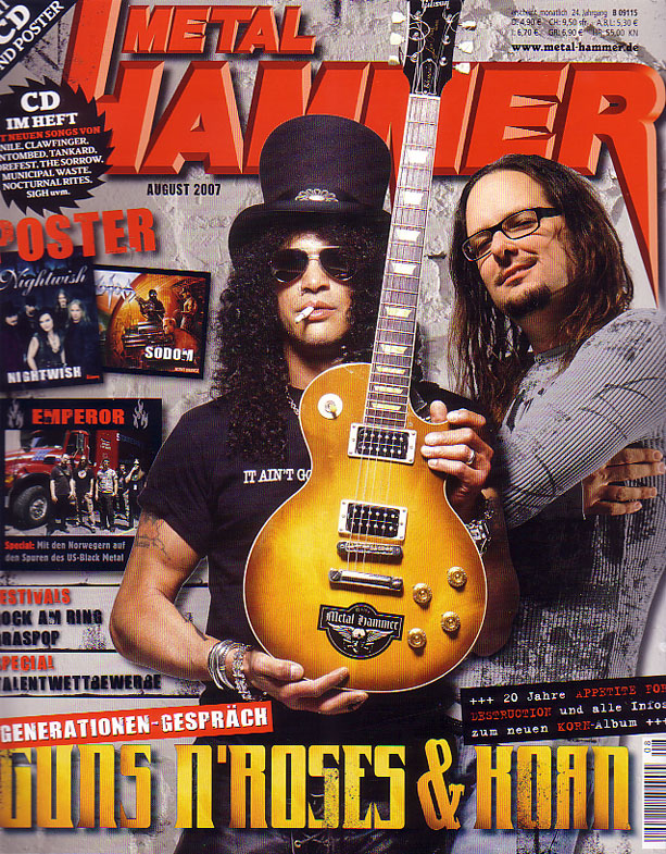

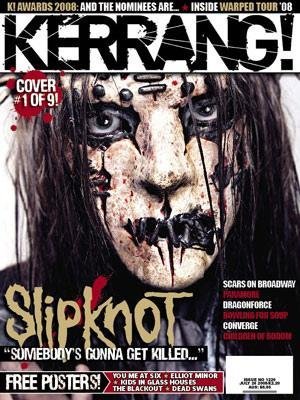
The type of magazine that I produced was typically aimed towards the heavy rock/metal market and when it came to the magazines I took my influence from it was mainly magazines such as metal hammer and a little bit of kerrang. After all that I believe that my magazine doesn't conform to the usual magazines out there because making a magazine that looks like every other magazine won't get you sales, it will just blend into the crowd and be ignored so I felt the best way to get the magazine noticed is to make is stand out, to do this I made it about heavy rock / metal music a genre of music that isn't followed to much by the mainstream these days. The only people who really follow it are a select group of people. I feel that my magazine challenges all the conventions of the modern day magazine because of the look, things such as the masthead are haggered and battered, and not a lot of things on my magazine are clean, by that I mean organized and well presented. All the information is in the right place and laid out well enough to read and follow but has a rough and rebellious feel to it and this adds to the magazines stand out ability.
This post needs some work.
ReplyDeleteYou have just done an intro to this post, now you need to explain how your magazine pages conform to or challenge magazine conventions.
ReplyDelete